
Faulty? What's wrong with him?
There's an interesting thread on the Doctor Who Restoration Team Forum at the moment - which has turned into a discussion about appalling cover art. Can anyone beat this supreme example, from the American Fawlty Towers laserdisc release?
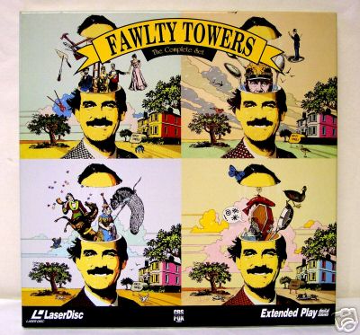
DO YOU SEE JOHN CLEESE WAS IN PYTHON!!!!!!!!!!!! And about as point-missing as you can get.
Any of you lot got any more examples of bad cover art?
About this entry
- By John Hoare
- Posted on Sunday, July 16 2006 @ 2:41 am
- Categorised in TV
- Tagged with fawlty towers
- 22 comments
Okay, okay...but please let me go on the record as saying that the region one DVD release has an excellent cover. This excuses not the laserdisc art, but it is important to mention that this awful packaging did not continue.
By Philip J Reed, VSc
July 16, 2006 @ 3:03 am
reply / #
Y'know what, though...there are details in that art that prove that somebody involved in its design had some idea of what was going on in the shows. There's a rat in a net, a woman with an ear-trumpet, a kipper-on-a-casket and an assortment of sppppppthhhhppoons coming out of his head...if I could find a larger version of the picture I might be able to make out more detail, too.
Which is pretty amazing. Because at first glance it really looks like they slapped some Python over existing publicity cutouts and called it a day. But--somewhere in that design process--thought was actually given to it.
Again, this excuses nothing. But I think it is worth noting.
By Philip J Reed, VSc
July 16, 2006 @ 3:07 am
reply / #
One of my favourite ever quotes, that. I am prone to quoting it at inopportune moments.
I take your point about the thought put into the laserdisc cover. Have you got a link to the R1 DVD cover, Phil?
By John Hoare
July 16, 2006 @ 4:00 am
reply / #
R1 DVD cover here: http://images.amazon.com/images/P/B00005LC1H.01._SS500_SCLZZZZZZZ_V1127936460_.jpg
By Rod Begbie
July 16, 2006 @ 4:47 am
reply / #
Ta.
But that's HORRIBLE, Phil. You're a madman!
By John Hoare
July 16, 2006 @ 5:50 am
reply / #
This is a cover of one of those public domain videos of cartoons from the forties which have fallen out of copyright. Now, I know these kind of releases are not subject to the same quality control as official products, but I still cannot believe that someone thought this artwork was good enough to use.
It's just so wrong in just about every respect. The sheer "will this do" factor just boggles the mind. It looks as if the Warners cast have been drawn from memory by someone who's never held a pen before. And that thing floating above Elmer's head? That is supposed to be Casper the Friendly Ghost. Yes, really.
By Phil_A
July 16, 2006 @ 4:12 pm
reply / #
>But that's HORRIBLE, Phil. You're a madman!
Alright, I take back calling it lovely. But what it was...see, over here (not sure about your videos) we had video copies split into two episodes each, and on each of these videos was a character illustration in the style you see above.
Except it was done on a really horrible black on yellow and white scheme that was pretty awful on the eyes. And it made the program inside seem like it'd be pretty low budget, as they obviously had somebody's uncle do the artwork.
So when the DVD came out and they swapped the background to blue it really made the old art look much, much better.
Therefore I believe my satisfaction with the DVD box is down to it using the same art which was previously used so horribly, which I saw as an improvement. For you, who I assume never got those illustrations, it must seem pretty bunk.
Or I'm a madman. Notice I haven't bothered to argue that much.
By Philip J Reed, VSc
July 16, 2006 @ 4:20 pm
reply / #
Here's the original VHS covers for Fawlty Towers in the UK: http://cgi.ebay.co.uk/3-FAWLTY-TOWERS-VIDEOS_W0QQitemZ230006605973QQihZ013QQcategoryZ61064QQrdZ1QQcmdZViewItem
I think they're rather nice, despite the 'comedy' font.
By Tanya Jones
July 16, 2006 @ 9:57 pm
reply / #
I can't believe the R1 cover. You shouldn't have to think 'what the fuck is that' when looking at a cover. If it didn't say 'Fawlty Towers' you wouldn't instantly think it was that.
By performingmonkey
July 17, 2006 @ 12:52 am
reply / #
Fine, you stubborn bastards. Here's one of the American VHS covers. Tell me the DVD box wasn't a major improvement:
http://ec3.images-amazon.com/images/P/6300248461.01._SS500_SCLZZZZZZZ_V1122563404_.jpg
By Philip J Reed, VSc
July 17, 2006 @ 4:47 am
reply / #
This one makes me want to stab things:
http://images.amazon.com/images/P/B00004W5Y2.01._SS500_SCLZZZZZZZ_V1056675077_.jpg
By Philip J Reed, VSc
July 17, 2006 @ 4:53 am
reply / #
An improvement, perhaps, but they're still shit.
By Ian Symes
July 17, 2006 @ 2:06 pm
reply / #
Oh dear, but not a major surprise is it.......
Isn't this the same country that thought Basil was surpless to requirements in their own version?
Python is so big there, I suppose it's an attempt to cash in. Perhaps the biggest clue to a total point missing is the use of happy looking Basils in the artwork...
By Cpt-D
July 17, 2006 @ 10:42 pm
reply / #
I hasten to add that I don't blame America as a whole for those covers. Just the clueless distributors. Same with the American version of Fawlty Towers - it was clueless execs who fucked that up.
Has anyone got any examples of bad UK covers for some US stuff in the interests of balance?
By John Hoare
July 17, 2006 @ 10:52 pm
reply / #
"Has anyone got any examples of bad UK covers for some US stuff in the interests of balance?"
Isn't it the case though that the US companies make the covers for the region 2 releases? And generally treat region 2 audiences as second rate customers? I didn't think it was normally quite the same as not understanding or having to translate one country's "product" for another's audience base.
By Geoff
July 18, 2006 @ 3:59 pm
reply / #
Has anyone got any examples of bad UK covers for some US stuff in the interests of balance?
Oh, hell, yes.
The Region 1 cover for the various versions of Mallrats, also the main US poster, and a wonderful piece of comic book pastiche artwork (check out the detail such as the crumpled spine and staples) :
http://ec3.images-amazon.com/images/P/B00000IQW4.01._SS500_SCLZZZZZZZ_V1056647726_.jpg
The original, utterly lousy, UK VHS cover :
http://images.amazon.com/images/P/B00004R6RZ.02._SS500_SCLZZZZZZZ_V1131638598_.jpg
That was also the original, vanilla Region 2 DVD cover. When a Region 2 version of the extras-laden package was first announced, there was initial hope that we might finally get the comic book cover. But no, instead, we just got a recoloured version of the original cack one, designed to overemphasise the role of Jay and Silent Bob in the wake of Strike Back. An improvement, but still not a patch on the Region 1 :
http://images.amazon.com/images/P/B0001B3ZQY.01._SS500_SCLZZZZZZZ_V56984971_.jpg
By Seb
July 18, 2006 @ 4:15 pm
reply / #
Fucking hell. That's appalling.
So *why* go to the trouble of redoing the cover? There's no logical point at all.
By John Hoare
July 18, 2006 @ 6:13 pm
reply / #
I don't know. But I do know that if I knew nothing about Kevin Smith, that cover would not attract my attention at all - in fact, the presence of Shannen Doherty would put me right off. Whereas if I saw the American cover on a shelf in a shop somewhere, my interest would immediately be piqued by the brilliant artwork (not least because it highlights the cameo appearance of Stan Lee).
I'm just lucky that I got shown the film by a mate one fateful day, and so my Smith-related ignorance was shortlived :-)
I did once ponder getting the Region 1 edition for the cover (and for the extras, before we got a "proper" version). There's now a tenth anniversary Mallrats X out in the States, too, with an extended cut of the film, but the Americans have gone and buggered that cover up, too, by putting in all that horrible yellow at the top and making it so the art doesn't look like a comic cover any more. Boooo.
By Seb
July 18, 2006 @ 6:26 pm
reply / #
> Isn't it the case though that the US companies make the covers for the region 2 releases?
It's not typical - if there's a re-design, it's usually created (or, at least, requested, changed, and approved) by the UK distributor and their PR/promo/whatever lot. It's supposed to help target the product, by using 'people who know the market'.
As this whole sorry affair is proving, it doesn't always work...
In many cases (though not with these examples), and as intended, the USA version looks better to Americans, but the Brits prefer theirs. And the Yanks dislike the UK's. Sweeping generalisation, obviously, but that's the plan.
It DOES happen - and it makes sense, given that the two cultures have significant artistic differences.
(It's interesting to look at magazines from both sides of the pond. The Stateside layout has distinct differences that my eyes are just not trained for - so it feels 'wrong'/'less good'.)
By Andrew
July 18, 2006 @ 6:48 pm
reply / #
>The original, utterly lousy, UK VHS cover :
I hate to burst your bubble with this, Seb, but that's also the version I'm most familiar with. I think that was the original release, later maybe replaced by the comic book cover "special edition" or something. But I can guarantee you the majority of VHS copies I've seen here have the unappealing cover art.
By Philip J Reed, VSc
July 18, 2006 @ 10:23 pm
reply / #
Well, you still got the comic book cover for the special edition DVD. About five years before we eventually got a special edition DVD with the redone cover. Bah.
(and the poster was definitely around for the release of the film, although it was laid out slightly differently and with comic book style blurbs instead of the tagline)
By Seb Patrick
July 18, 2006 @ 11:37 pm
reply / #
I think I also credit that very uninspired cover with why I've never bothered to rent the movie. I can't think of anything that might excite me less.
By Philip J Reed, VSc
July 19, 2006 @ 2:16 am
reply / #